Thirty minutes. No pitch. Just a map of what your marketing is missing. Send your brief →

FIELD GUIDE 07
The homepage checklist
People decide how they feel about your website faster than they can read a single word of it. Then they spend the rest of the visit confirming that first judgement.
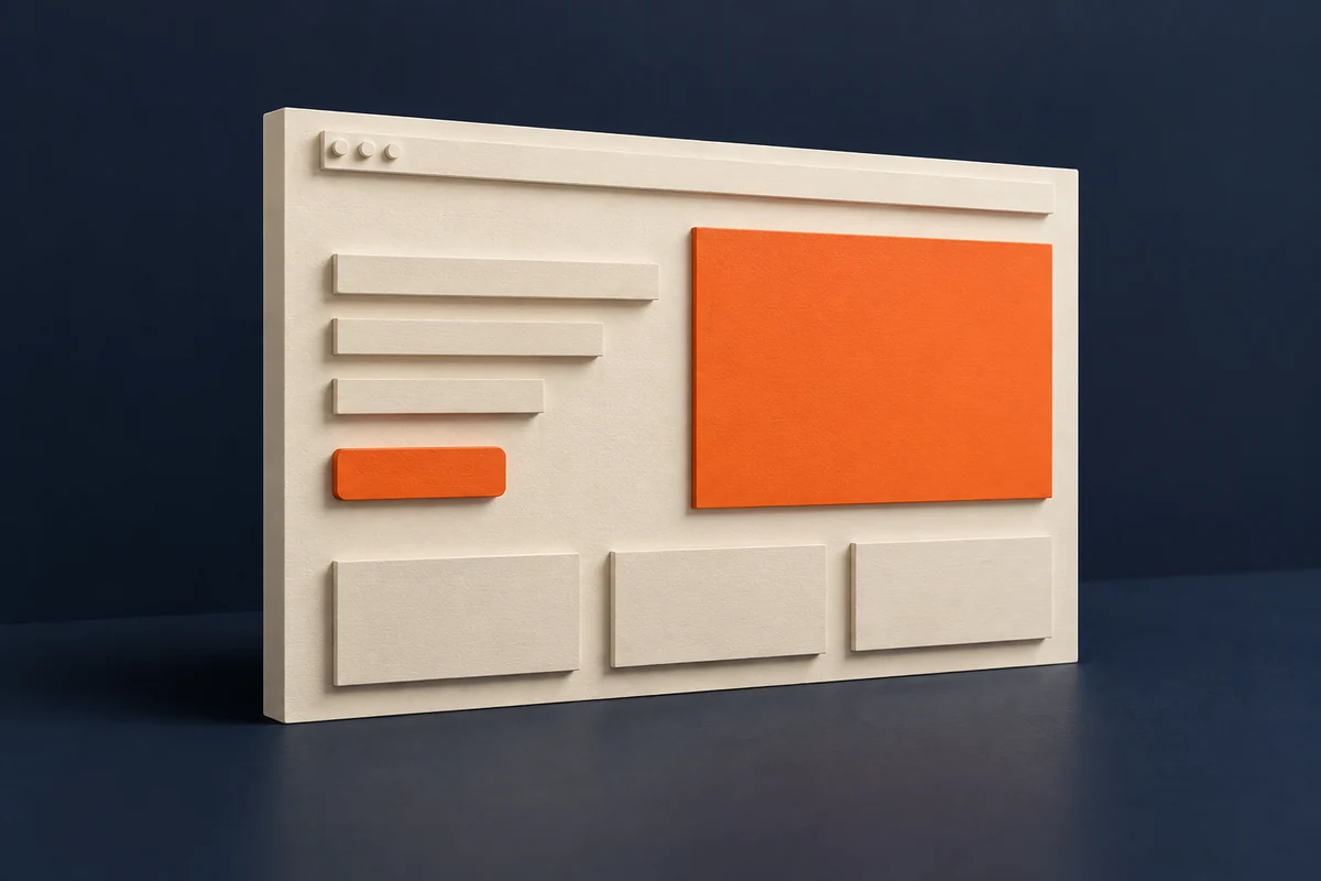
FIG. 01 · THE FIRST IMPRESSION
- 50msis enough for visitors to form a visual appeal judgement that stays stable on longer exposure. Lindgaard et al., Behaviour & Information Technology, 2006.
- peer reviewedThis one is not a marketing statistic. It is a published experimental study, which is why it has survived twenty years of being quoted.
The practical consequence is uncomfortable: by the time a visitor reads your headline, they have already decided whether they trust you. The headline’s job is to confirm a good first impression, not to create one.
The five-second test, do this first
Before changing anything, find out what your homepage currently communicates. This takes fifteen minutes and it is more useful than any analytics report.
Find five people who do not know your business
Not staff, not family, not anyone who has heard your pitch.
Show them your homepage for five seconds, then hide it
Phone screen, not desktop. That is how most people will actually see it.
Ask three questions
What does this business do? Where does it operate? What would you do next if you needed them?
Write down their exact words. Do not explain, do not correct them, do not defend the site.
Count how many got all three right
If it is fewer than four out of five, the problem is the homepage, not your traffic, and no amount of extra advertising will fix it.
Above the fold, the only four things that belong there
- What you do, in plain words. "Emergency plumbing in Leeds" beats "Delivering excellence since 1998" every time.
- Where you do it. The town or region, visible without scrolling. This is the most commonly missing element on service business homepages.
- One piece of proof. A star rating, a review count, a recognisable client, a years-in-business figure. One, not six.
- One obvious next step. A phone number that is tappable on mobile, or a short form. Not both competing for attention.
THE MOST COMMON FAILURE
A large photo, a slogan, and a menu. The visitor can tell it is a business but not what kind, where, or why you. That homepage tests at about one out of five, and the owner usually believes traffic is the problem.
The rest of the page, in order
| Section | Job it does | Common mistake |
|---|---|---|
| Services | Name each service in the words customers use | Internal jargon, or one vague "what we do" block |
| Proof | Reviews, photos of real work, before and after | Stock photos and unattributed testimonials |
| How it works | Three steps, remove the fear of the unknown | Skipped entirely |
| Area covered | Name the towns explicitly | "Nationwide" when you are not |
| Trust signals | Insurance, accreditations, guarantees | Buried on a separate page nobody visits |
| Contact | Phone, form, hours, repeated at the bottom | Only in the header, only on a contact page |
The mobile check
On an actual phone, not a resized browser window
- Is the phone number tappable, and does tapping it start a call?
- Can you read the headline without zooming?
- How far do you scroll before you know what the business does and where?
- Does anything cover the screen in the first few seconds? Chat bubbles, cookie banners and popups all fire before the visitor has decided anything.
- Does the form fit on one screen, or does it demand scrolling before the first field?
What to change first
In order, because the order matters more than the list. Stop after the first three if that is all you have time for, because they carry most of the effect.
- Rewrite the headline to say what you do and where, in plain words.
- Put one piece of proof directly beneath it.
- Make the phone number tappable and visible without scrolling on mobile.
- Replace stock photography with photographs of your own work.
- Cut anything above the fold that is not one of the four things listed earlier.
- Re-run the five-second test with five different people.
FIG. 03 · SOURCES, CHECKED 2 AUGUST 2026
Every number above was traced to its primary source before publication. Where a widely repeated figure could not be verified at the source, it was cut rather than repeated.
- VerifiedLindgaard, Fernandes, Dudek and Brown, "Attention web designers: You have 50 milliseconds to make a good first impression!" Behaviour & Information Technology, Vol 25, 2006. Found that visual appeal judgements of web pages form within about 50ms and correlate strongly with judgements made after longer exposure.
- UnverifiedThe "94% of first impressions are design related" figure Widely quoted from a study of health website feedback. Attribution in secondary sources is inconsistent, so it is <b>not</b> used in this guide. The five-second test replaces it, because it measures your own homepage rather than an average.
RANKTHREAD
Test before you redesign
Most homepage rebuilds start with taste and end with the same conversion rate. Starting with five strangers and a stopwatch tends to produce a shorter, cheaper and more effective list of changes.
RANKTHREAD
Get the next one
We publish a new field guide most weeks. Plain method, sources cited, no pitch. Leave your address and we will send the next one.
